Falcon Brook
By Frances Presley, commissioned by Tideway
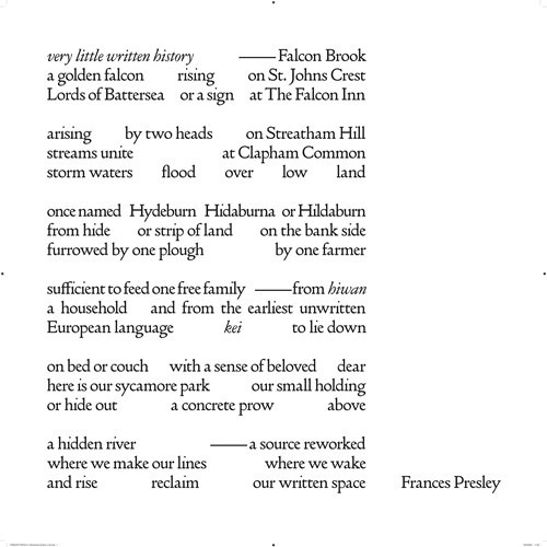
Poet Frances Presley was commissioned by Tideway to create a poem for a plaque at Falconbrook Pumping Station. Her response draws on the history of the Falconbrook – a lost river prone to flooding – as well as on the major redevelopments in the area and their impact on green open space. She undertook detailed research into the site, which occupies part of York Gardens near Clapham Junction. Drawing on Tideway’s Heritage Interpretation Strategy, she responded to the theme for the Central section of the tunnel: Babylon to World City: Civic London. Her poem is also rooted in the specific history and character of the Falconbrook site, particularly its connection to the development of London’s modern sewer system.
The poem explores the layered histories of the land and river through the etymology of Falcon Brook, particularly its earlier name, Hideburn. The name Falcon Brook likely originates from the family crest of 17th-century landowners following the Reformation. Hideburn, used in medieval times when the land was church-owned, refers to strips of farmland called ‘hides’ – a term rooted in the ancient word for ‘household’. Frances connects this historic notion of household to the present-day Winstanley and York Road Estates, their communal park, modernist concrete flats, and the people who live and work there. She also plays with the contemporary meaning of ‘hide’ to reflect on obscured or forgotten human histories.
The river itself is a central element of the poem. It has two tributaries that merge as they descend from the hills, and has long threatened to flood the surrounding area – a risk mitigated by its redirection and containment. In the final verse, the river, land, and lives of local residents are given equal value, all rising to the surface through the act of writing.
Frances collaborated with typographer Rob Green to realise the poem’s layout in Doves Type. The justified margins evoke a strip of land and the river’s containment. The poem’s spacing and punctuation carry both semantic and visual weight, inviting multiple interpretations of its lines and alluding to unwritten or hidden histories, as well as the buried flow of the river itself.
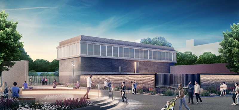
Installed at Falconbrook Pumping Station, the poem offers a quiet yet resonant presence in the landscape. Conceived as an accessible work rich in historical and contemporary resonances, it reasserts a sense of shared history and lived experience.
The poet has said:
‘When I researched the Falconbrook and its surrounding area there seemed to be very little written history, and it was almost as hidden as the river itself is now. Yet we know that history was made by the people who lived here and worked the land, alongside the river. I hope this poem and its artwork will help to reassert both our common history and our contemporary creativity’.


